Hero Carousel
This component is a specific component if you want to have multiple Hero's in your component that user can click through. Not something that would be used often but is very flexible.


Boys Town Hositpital


Parenting
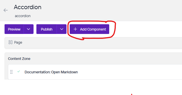
Once you are on the page you are wanting to add content to go ahead and add the component by pressing Add Component.
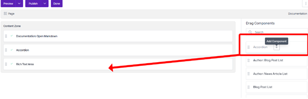
On the right side you will see the choices of components to add. Go ahead and you can either press the + button on the component you want to add or click, hold, and drag the component into the content zone. There is also a search bar as well if you are having trouble looking for any component.
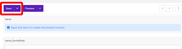
The first thing you will need to do is save the component so we can add Heros to it.
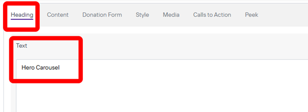
Next you will want to click New. After that we will need to go through the tabs and fill out the fields. Under heading we will fill out the Text which is the title of the heading you will see at the very top of this hero.
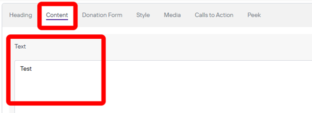
Next you will go to content and this is where the text will show up underneath the Heading of this hero. This can be a description or information.
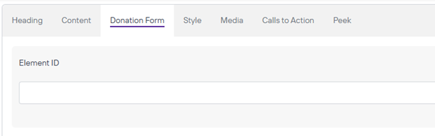
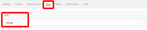
Next if there is a donation form you can fill out that field as well. Next is the style you can change which can be different colors for each hero you have on the carousel.
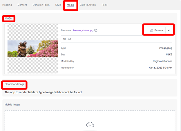
The Media you will want to choose depending on what website you are working on. You will want to click browse on Under Image if your images are in Agility but if they are in Cloudinary you will want to press Image in the Cloudinary Image box instead. Please remember to add Alt Text whenever there is an empty Alt Text field with a short description of the image.
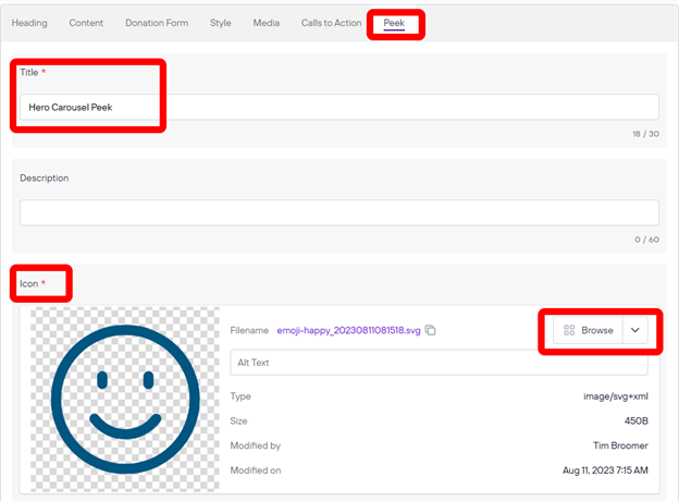
For now we will skip the Calls to Action because you need to save the component first before we can add a button to this Hero but to save we need to fill out the Peek tab with some required fields to save. Go to the Peek tab and Here you will need to fill out the Title and add an icon. Once you have added these required field you can save the component and we can add Calls to Action if we need to. Please remember to add Alt Text whenever there is an empty Alt Text field with a short description of the image.
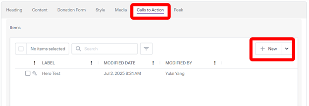
Calls to action Tab we can click new to add a new button to the hero.
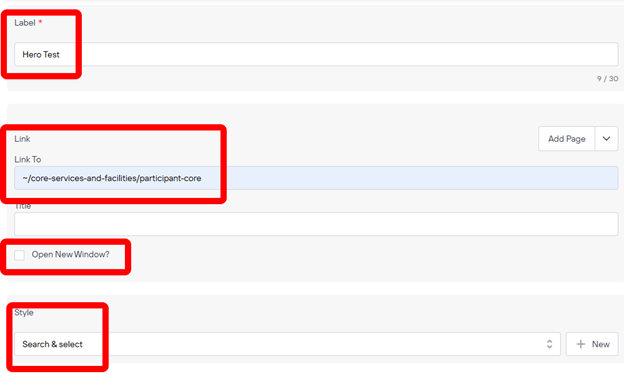
Once we are in the Call to Action we an fill out the Label which is what the button will say and Link it to whatever webpages we need to. If you are linking to another page on the same website all you need to do is add a “~/the rest of the URL here after the root” After you can change the style as needed. Save after you are done.
That should be the last thing you can do with this hero. Now you can repeat this entire process to add multiple Heros to this component that you can click through.