Icon Card Grid
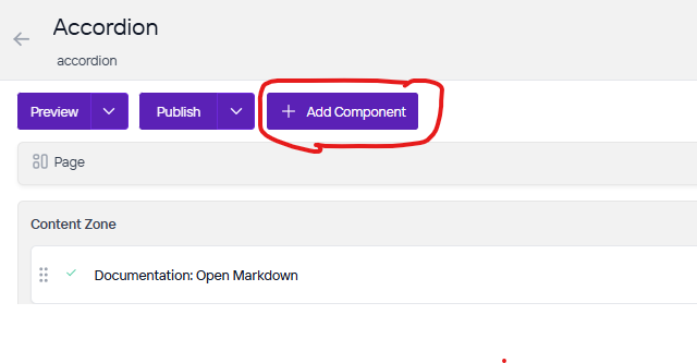
Once you are on the page you are wanting to add content to go ahead and add the component by pressing Add Component.
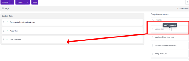
On the right side you will see the choices of components to add. Go ahead and you can either press the + button on the component you want to add or click, hold, and drag the component into the content zone. There is also a search bar as well if you are having trouble looking for any component.
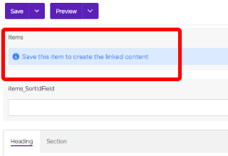
Before we can add items in the component you will first need to save it.
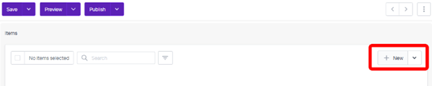
Go ahead and click on New.
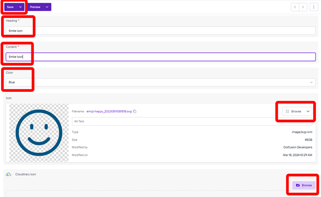
Now you will want to fill out the heading for the title of the icon, content for any other content you want to add to this icon, color, and next you will choose your image depending on what website you are editing. You will click browse under Icon or under Cloudinary Icon if you are using images from Cloudinary. Please remember to add Alt Text whenever there is an empty Alt Text field with a short description of the image.
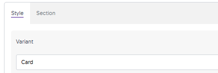
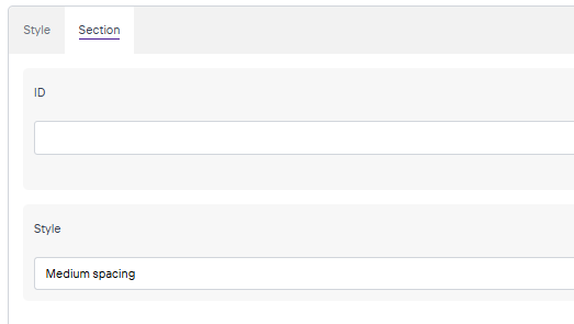
When you have added your icons you can change the Variant and Style under the Style and Section tabs at the bottom of the component.